Simplifying Customer Acquisition for a Full-Fibre Broadband Provider
LightSpeed Broadband is a UK full-fibre provider delivering ultrafast, reliable connectivity to homes and businesses. I contributed to redefining their customer acquisition journey, improving how users discover, understand, and convert to their services.
Overview
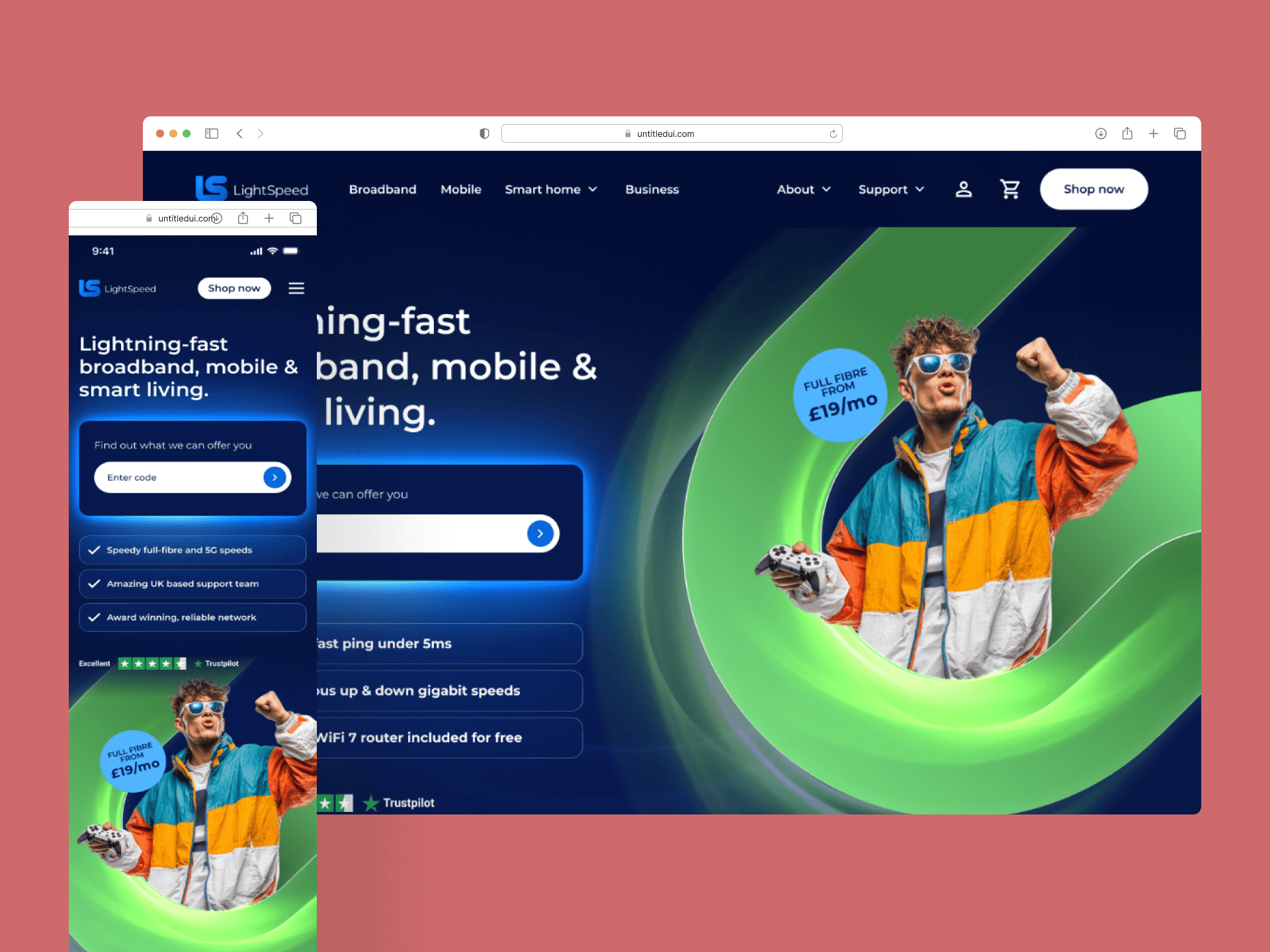
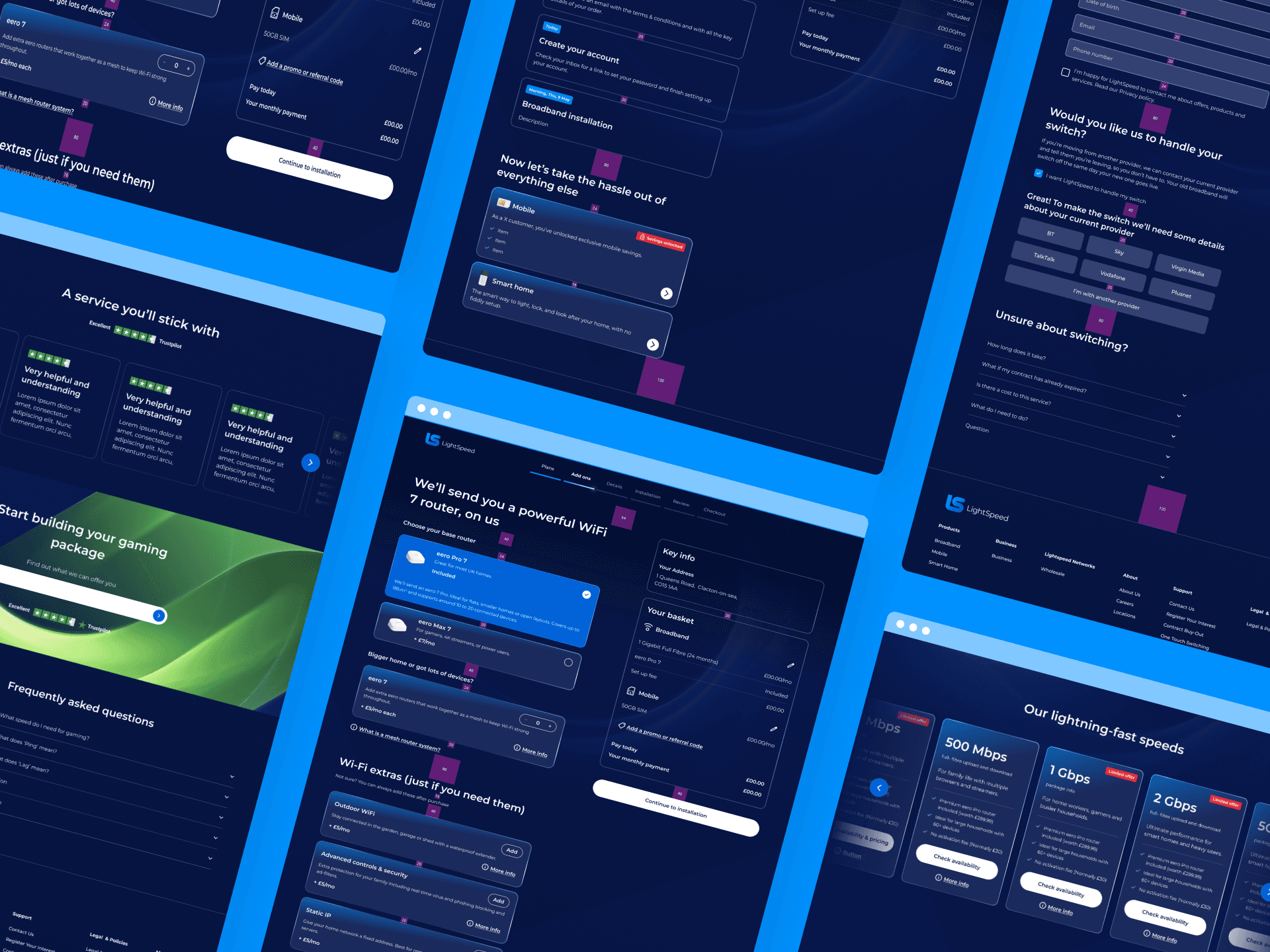
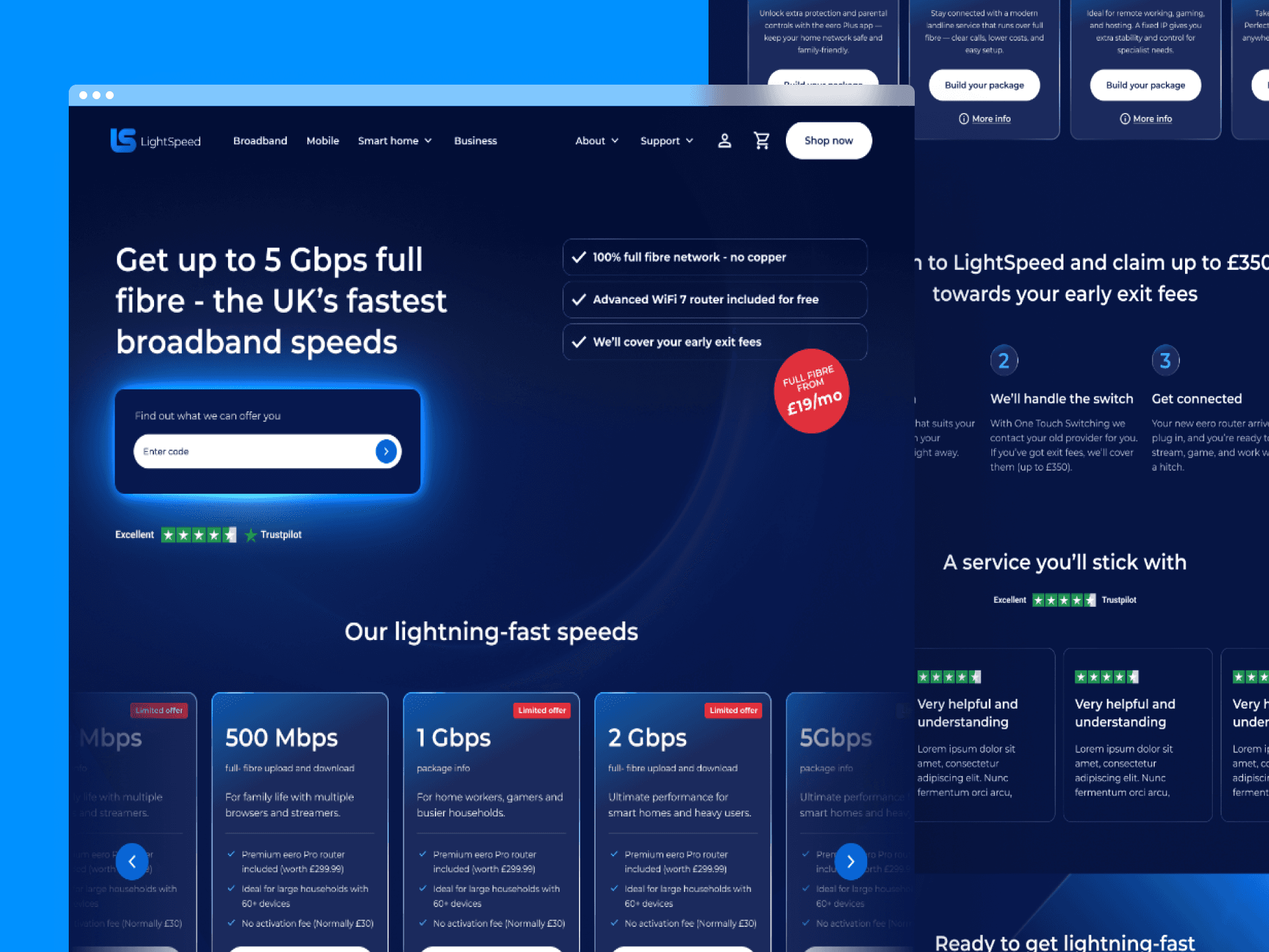
LightSpeed Broadband offers full-fibre internet to homes and businesses across underserved regions of the East of England, symmetrical speeds, transparent pricing, UK based support. A strong product, but a digital experience that wasn't keeping pace. As the business scaled, prospective customers were navigating coverage checks, package comparisons, and pricing decisions on a platform that created friction where there should have been clarity.
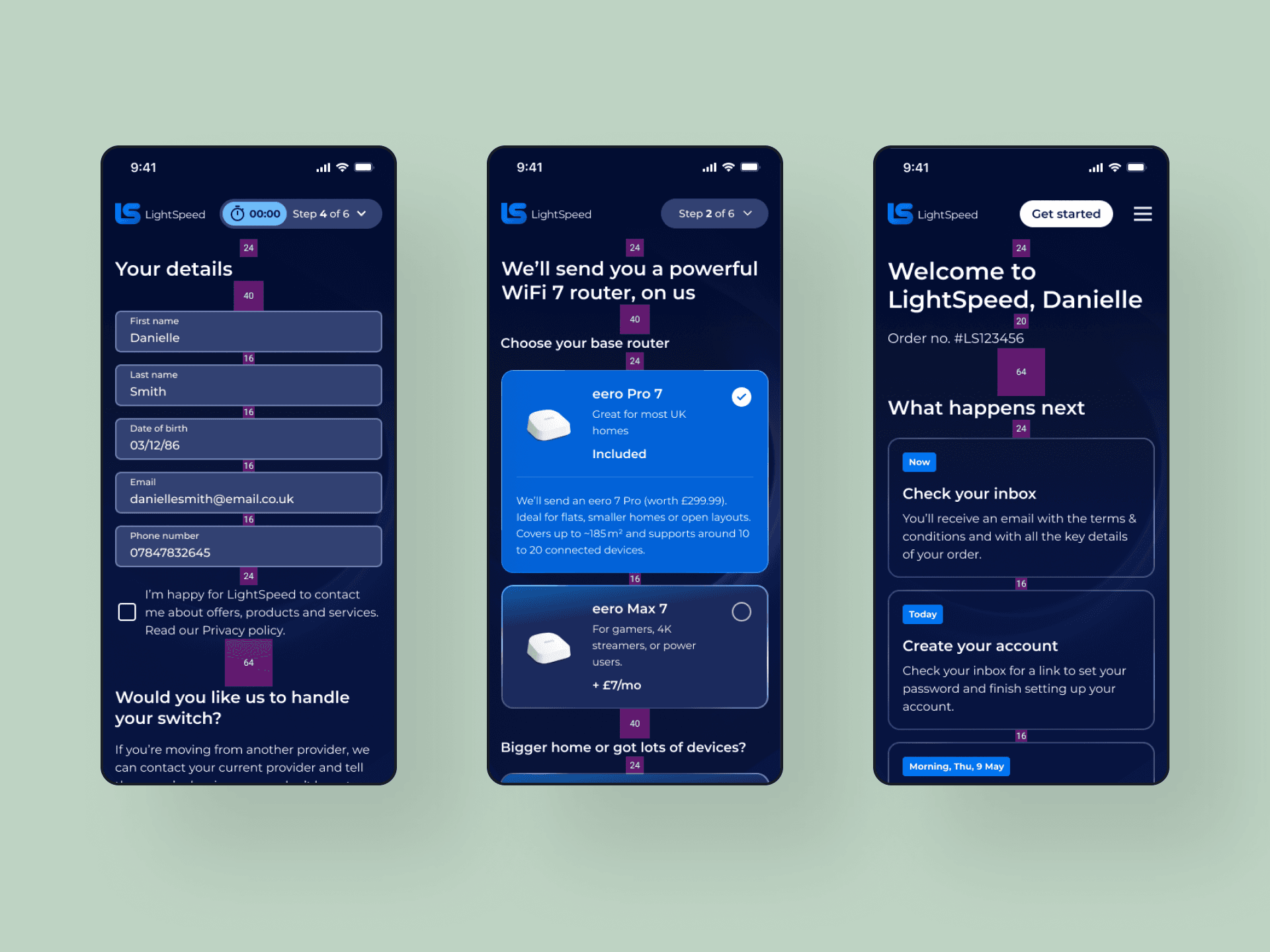
I led the front-end work on LightSpeed's customer acquisition journey, from discovery through to sign-up. Working alongside product, design, and marketing teams, I translated the redesigned journeys into a faster, more reliable experience and instrumented the funnel to surface exactly where users were stalling, reducing friction without oversimplifying a genuinely complex product decision.
How we built it
We improved the front-end architecture for performance and smoother rendering, restructuring components and refining page rendering strategies to reduce latency. Analytics and tracking were significantly enhanced to surface drop-off points clearly, creating the foundation for ongoing, data-driven optimisation across the funnel.
Tech stack

Next.js

TypeScript

Contentful
GraphQL
+35%
increase in conversion rate across key acquisition journeys
~30%
reduction in drop-off during package selection and checkout
~40%
faster page load times across the acquisition funnel
~35%
reduction in bounce rate on key acquisition landing pages
There's more to this story...
Before, drop-off points were anecdotal. After, they were visible and measurable. That shift meant the team could prioritise optimisation work based on evidence rather than instinct, creating a feedback loop that continued improving results after launch.
The design team simplified the pricing presentation, form flow and trust signals at the point of commitment. I rebuilt those journeys on a faster, more reliable front end and instrumented them so we could measure the impact. Users had been abandoning when they weren't confident in what they were signing up for, and addressing that directly moved the needle.
Performance at the tooling level. Bun significantly reduced build and script execution times, which improved the development experience and deployment speed without requiring changes to the application architecture itself.
Requirements and timelines shifted often as the acquisition funnel was tested and refined. I leaned on AI tooling to move faster through that churn, scaffolding components, drafting and refactoring code, and turning rough requirement changes into working implementations quickly. That kept delivery responsive without compromising the quality of the front end underneath.